This post original appeared on Sightline’s Daily Score blog.
If you’re reading this, then the phrase “interesting demographic data” probably doesn’t sound like an oxymoron to you. That’s a good thing, because you’ll find a heap of it in a new analytical report out on bicycling. Among other things, we get a clearer view of the race and income components of U.S. bicycling.
Here’s a look at bike trips broken out by racial and ethnic categories:
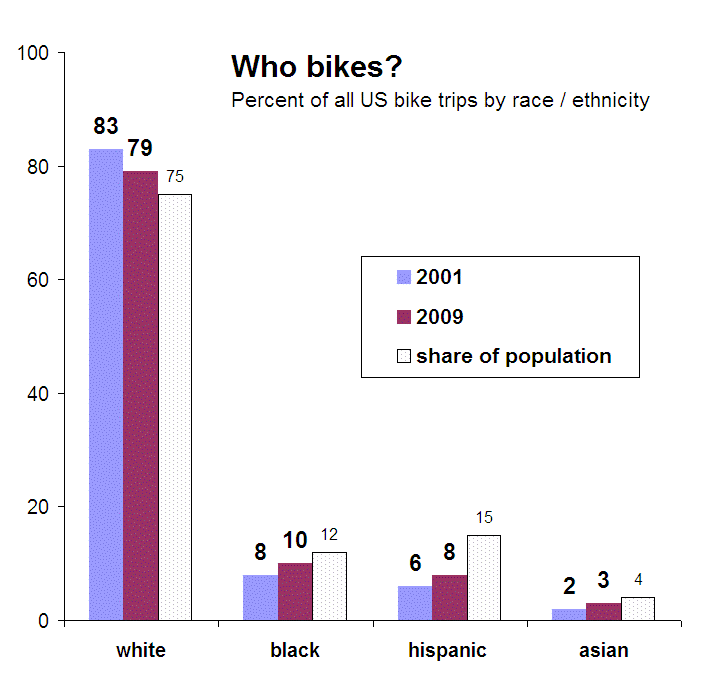
Two big things stand out here for me: 1) white people remain somewhat overrepresented; but 2) bicycling appears to be trending toward racial parity. As of 2009, roughly 21 percent of all bike trips in the U.S. were made by people of color, and it looks as though U.S. cyclists may soon look pretty darn similar to the nation as a whole.
Now, here’s a look at bike trips broken out by income categories.
If you divide up Americans by income into four equally sized categories (“quartiles” in the business), this is how they represent among bike trips:
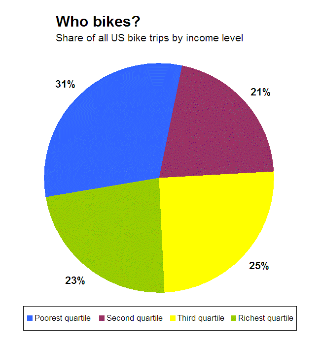
Surprised? Contrary to popular convention, the biggest share of bicyclists isn’t yuppies, it’s low income people. In fact, the lowest-earning quarter of Americans make nearly one-third of all bike trips. Among that group, I would expect to find at least some fraction of working poor, students, the unemployed, and retired people of modest means. No doubt there are almost as many reasons to bike as there are cyclists, but it’s clear that bikes are a favored choice among those on a budget.
 Photo: Sam JavanrouhThe big takeaway for me, however, is looking beyond low-income riders. Bicycling is remarkably evenly distributed among the remaining three quartiles. With the exception of the overrepresented bottom quartile, bike trips don’t appear to be the province of any one income class more than any other.
Notes: I created these charts using the data from Table 3 on page five of “Analysis of Bicycling Trends and Policies in Large North American Cities,” published by the University Transportation Research Center, authored by John Pucher at Rutgers and Ralph Bueler at Virginia Tech. Bike trips by income refer to 2009. “Share of population” uses the percentage reported by the American Community Survey’s 2005-2009 averages, and does not include multiracial figures.
Editor’s note: we replaced the top chart that originally appeared in this piece with a corrected version.