(Part of the How to Talk to a Global Warming Skeptic guide)
Objection: Global warming has been going on for the last 20,000 years.
Answer: It is true that 20,000 years ago the temperature was some 8 to 10° C colder than it is today. But to draw a line from that point to today and say, “look, 20K years of global warming!” is dubious and arbitrary at best.
If you have look at this graph of temperature, starting at a point when we were finishing the climb out of deep glaciation, you can clearly see that rapid warming ceased around 10,000 years ago (rapid relative to natural fluctuations, but not compared to the warming today, which is an order of magnitude faster). After a final little lift 8,000 years ago, temperature trended downward for the entire period of the Holocene. So the post-industrial revolution warming is the reversal of a many-thousand-year trend.
A closer look at today’s trend, within the context of the last 1,000 and 2,000 years, makes it even clearer that today’s trend is striking — opposite to what one would expect without anthropogenic interference.
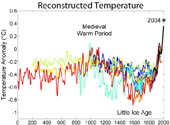
(Courtesy of Global Warming Art. See source for details on the various reconstructions tangled above.)
If you really want to play the “global warming started X years ago” game, you should talk about how we’re reversing a 5-million-year cooling trend — or go crazy and track global temperatures right back to the origins of the planet! Not that there’d be much point …
A message from
Your support keeps our climate news free.
Grist is the only award-winning newsroom focused on exploring equitable solutions to climate change. It’s vital reporting made entirely possible by loyal readers like you.
At Grist, we don’t believe in paywalls. Instead, we rely on our readers to pitch in what they can so that we can continue bringing you our solution-based climate news. Donate today to keep our site free.

