First there was Walk Score, the web tool that calculates how walkable a neighborhood is and ranks it on a 100-point scale.
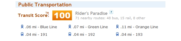
Today the same developers release Transit Score, an app that ranks how well-served a location is by buses and rail lines. It measures how far you’d have to walk to a transit stop and how often trains and buses arrive (trains count for more) and assigns a separate 1-100 score.
New York City’s Grand Central Station, for example, gets a perfect 100 (a “Rider’s Paradise”). Transit Score so far serves 30 major U.S. cities that make their transit data available in a developer-friendly format.
 It’s one of three new features released today by Front Seat, a Seattle “civic software” company that works to promote walkable neighborhoods. The other two are equally intriguing.
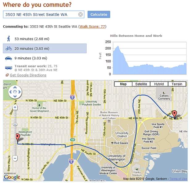
The new commute reports feature side-by-side estimates of how long it takes to reach a destination by walking, biking, driving, or riding transit. It’s similar to Google Maps, from which it draws data, although Walk Score’s presentation makes it easier to compare options.
The commute reports also include a topographic map — a very helpful feature if you’re a cyclist in a hilly place like Seattle. Unless it discourages users from biking …
 Finally, Walk Score adds a home and transportation costs calculator to help people get a fuller picture of what it costs to live somewhere. It prompts users to enter their annual income, monthly housing costs, and monthly transportation spending (providing estimates if users don’t know). Then it determines whether their housing situation is affordable, based on new measure of affordability that’s making waves in housing policy circles.
The conventional — and flawed — rule of thumb for housing affordability is that families should spend no more than 30 percent of their monthly income on housing costs. Walk Score uses a different standard that suggests households should spend no more than 45 percent of monthly income on housing and transportation costs.
The 45-percent guideline comes from the Housing + Transportation Affordability Index developed by the Center for Neighborhood Technology (CNT) in Chicago. It’s a way of reminding people that when they choose a home, they’re also choosing a location, and the transportation costs that go with it.
“We want to help customers look holistically at the total cost of choosing to live in a particular location,” Walk Score CEO Josh Herst told me last week. “Transportation is often a hidden expense. We want to increase transparency for it.”
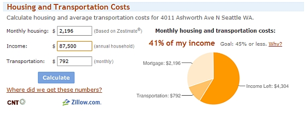 Transportation costs may be tougher to track than housing, but they tend to follow a pattern: Households in traditional suburbs spend 24 percent of their income on transportation on average, according to CNT, while households in walkable urban areas spend only 16 percent.
I’ve been reporting on other innovative uses of the CNT’s H+T Index, such as the Abogo web app. It’s partnership with the popular Walk Score could give the index its biggest exposure yet.
Like Walk Score, Transit Score will be available as an API, a format that developers can integrate into other sites and apps. Ziprealty.com has already agreed to incorporate the tool. (Much of Walk Score’s use comes through its iPhone app and through real estate sites such as Zillow.com that have added it.)
Herst said Transit Score will add more cities as they make their transit data available. His team is working on a separate set of improvements to Walk Score — to make it stop assuming people will walk across lakes, rivers, and interstates, for example — that is still in the works.