My co-presenter at last weekend’s Carbon Neutrality Unconference, smart-guy Pete Erickson of Stockholm Environment Institute, used four slides that are worth sharing again. Taken together, they’re an excellent — if somewhat wonky way — to think about the basic structure of reducing emissions.
1. What are the cheapest reductions?
 (Click for larger version)
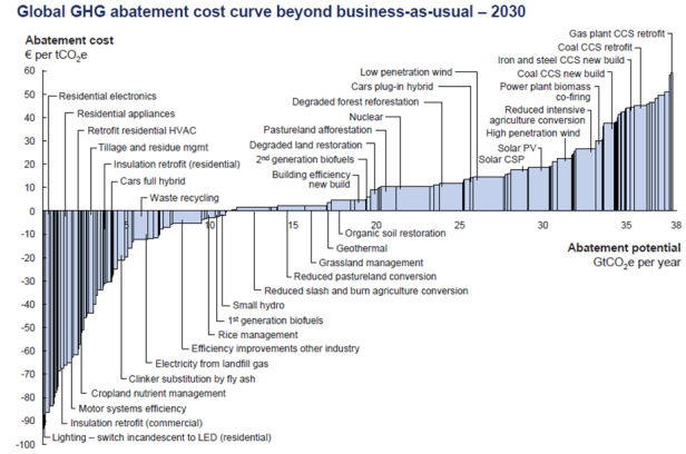
This McKinsey Institute chart depicts the cost of various carbon “abatement” (i.e. “reduction”) strategies given current technology. The bars that fall below the horizontal axis depict abatement opportunities that pay for themselves (such as energy efficiency). The bars above the x-axis show the strategies that cost money (such as sequestering carbon from coal plants), at least given the current state of technology. The width of the bars depicts how much carbon reduction is available.
(Source: McKinsey & Company, “Pathways to a Low-Carbon Economy“)
2. How far do the reductions get us?
 (Click for larger version)
Another chart from McKinsey. This one uses a “wedge” diagram to illustrate how much carbon reduction we can achieve from several major categories of abatement strategies.
(Source: McKinsey & Company, “Pathways to a Low-Carbon Economy“)
3. Who takes responsbility?
 (Click for larger version)
Based on each country’s population and historical contribution to climate change, this chart depicts how much carbon “budget” countries have if we were to equitably distribute the right to emit carbon in the future. The pale color shows how much a country has “consumed” (i.e. “emitted”) and the dark color shows how much budget remains. The United States has a negative carbon budget, shown by the dark bar below the horizontal axis, implying that an equitable distribution of carbon resources would require the U.S. to go beyond carbon neutrality.
(Source: German Advisory Council on Global Change, “Solving the Climate Dilemma: The Budget Approach” )
4. What does “carbon neutral” mean if we take greater responsibility?
 (Click for larger version)
A closer look at the carbon responsbility for the United States under an equitable distribution of carbon resources. Notably, the red line — showing the “fair share” for the U.S. — dips below zero (net carbon neutral) by around 2025, and continues on a downward path. A significant share of the U.S. reductions, however, are “mitigation” actions (i.e. “offsets”) funded in other countries.
(Source: Greenhouse Development Rights Book, second edition)
This post originally appeared at Sightline’s Daily Score blog.