Southern Utility Blues, part one

Carbon geography 6

If you want to understand what’s been going on behind closed doors as members of the House Energy & Commerce Committee hash out a compromise on the Waxman-Markey bill, I highly recommend reading this post by enviro-blogger Devilstower at Daily Kos.

Devilstower references a new (as-yet-unpublished) paper I mentioned the other day:  “Carbon Geography: The Political Economy of Congressional Support for Legislation Intended to Mitigate Greenhouse Gas Production” [PDF],  by UCLA economics professor Matthew Kahn and Michael Cragg of the Brattle Group. I know PDFs are not everyone’s favorite leisure activity, but read this paper. [I’ve put the maps from it at the bottom of this post.]

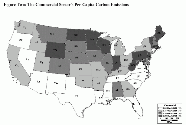
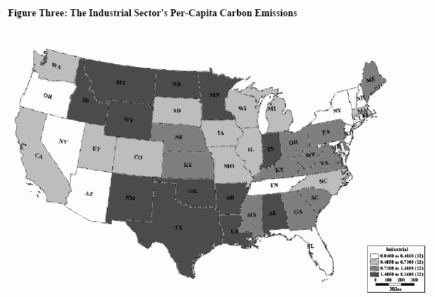
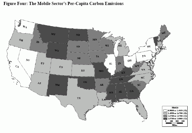
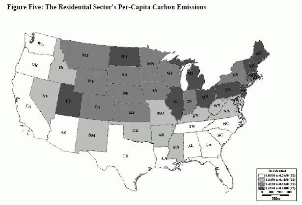
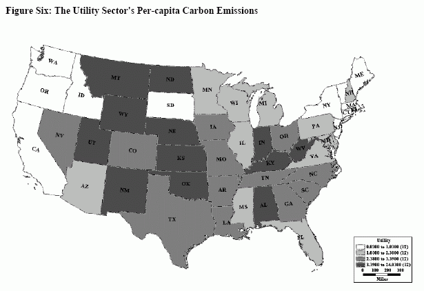
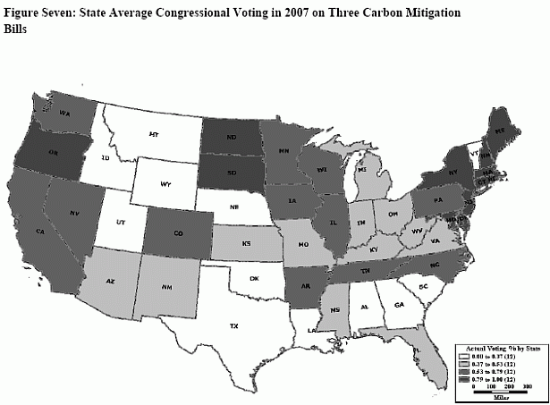
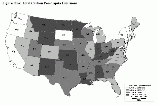
It’s about per-capita carbon emissions and how they vary among U.S. states, both overall and by economic sector. Unsurprisingly, states with high per-capita emissions roughly map to lawmakers hostile to carbon legislation. Also unsurprisingly, the disparities trace in large part back to coal.

Coal has had areas of the South and Midwest in a devil’s bargain for decades now: cheap electricity in exchange for poverty, low-quality social services, and bought-off politicians. Read Devilstower:

What the report seems to be ignoring is that the costs of the current system go far beyond the relative price of electricity and the diminishing number of jobs in the mining industry. People aren’t trapped in carbon-extraction industries by some law of nature. They’re trapped by policy and intent. Areas that are centered on extraction industries are far more likely to be poor exactly because of the nature of these industries. These are very top heavy businesses that leave behind environmental damage, little to no infrastructure improvements, and a populace whose jobs skills are not easily transported to another industry. Over the last thirty years, voters in these areas often support conservative politicians because they see these politicians as protective of their jobs. To support these industries, conservative politicians remove regulation that would improve environmental remediation, reduce taxes that would benefit communities, and drive out unions that would protect worker’s rights.  The result builds a cycle that’s more difficult to stop than a two-pack a day smoking habit.

Areas dependent on extraction industry might as well be mining poverty.

Why is it still going on?

So why don’t the people in these areas break this cycle? Because they’re convinced—with pretty good reason—that if the carbon economy folds, they’ll be out of work and the rest of the country won’t lift a finger to help them.

You need something more to explain the thinking of legislators from carbon intense states. One of the minor revelations in the Kahn-Cragg paper is the “carbon intensity” of the House Energy & Environment Subcommittee itself, the bill’s birthplace:

The average Democrat on [the Energy and Environment Subcommittee of the House Energy and Commerce Committee] represents a district whose per-capita carbon emissions are 31 percent higher than the average Democrat in Congress, and the average Republican on this subcommittee represents a district whose emissions are 20 percent higher than the average Democrat on this committee.  These numbers tell a clear story that the Energy and Environment Subcommittee consists of members of both parties who represent carbon-intensive districts.

“Carbon-intensive” reduces in large part to coal: mining it, burning it, depending on its cheap power. The Democrats who pushed Waxman down on targets and permits (Boucher and crew) are thinking about what’s in the best interest of coal utilities. (More on that in part two.)

Here are the maps from the Kahn-Cragg analysis (reprinted here with the authors’ permission):

Kahn: total per-capita emissions
Kahn: commercial per-capita emissions
Kahn: industrial per-capita emissions
Kahn: mobile per-capita emissions
Kahn: residential per-capita emissions
Kahn: utility per-capita emissions
Kahn: Kahn: state average congressional voting on green legislation

David Roberts is staff writer for Grist. You can follow his Twitter feed at twitter.com/drgrist.

Advertisement
Advertisement
  1. Sean Casten's avatar

    Sean Casten Posted 3:20 pm
    18 May 2009

    A few observations:1. Eyeballing the charts, it looks like the per capita designation probably confuses some of the conclusions.  Maine is a lightly populated states, but is a net exporter of electricity.  Ergo, it shows up as a big source in the region, although whether that's because of population or CO2 is hard to tell.2. The electric and industrial sector charts seem to (roughly, and unsurprisingly) follow US manufacturing.  Which, of course, also follows coal, to some degree, given the overlap between the rust belt and the coal belt.  But the whole country benefits from manufacturing.  Thus - like the Maine example - the dependence of neighboring states on the CO2 emissions elsewhere - or at least the goods & services associated therewith - almost certainly complicates any resulting political calculus to a degree that the coal state v. congressional voting relationship is likely to be subtle.  Indeed, the conclusion that Energy Committee members are overwhelmingly from CO2-producing regions could likely be equally reframed as Energy Committee members are overwhelmingly from regions that consume a lot of energy.  Framed one way, they're in cahoots - framed the other, they're the ones most directly affected by changes in US Energy Policy.Bottom line is that I don't see the compelling linkage in the data, but maybe there's something I'm missing.  It does seem that there is a critical question, too often overlooked as to how to reduce CO2 emissions while still maintaining our nation's manufacturers.  As a friend once said in criticism of MA (state) economic policy, "at some point, you come to the conclusion that you cannot build an economy on hedge funds and organic grocery stores alone". In other words, one can simultaneously be anti-CO2 and pro-manufacturing - but our CO2 policy debate has been largely framed in a way that doesn't give such a coalition a voting platform.
  2. Clifford Wells's avatar

    Clifford Wells Posted 7:49 pm
    18 May 2009

    Right, the study is based upon 2002 production of carbon - not consumption.  So some categories such as utilities could be exporting that stuff everywhere.  For example, Texas is a huge carbon producer but a good part of the liquid stuff (gasoline, diesel, jet fuel) is piped to the Eastern Seaboard.  That's a major drawback to the maps.  I know this was more about the politics but as a geographer, I take exception to these maps and am surprised that Batelle had the balls to publish them except for their one-sentence caveat way up in the introductory sections.
    1. atreyger Posted 12:58 pm
      19 May 2009

      I fully agree, it appears that the linkage is based on production, not consumption. There is a clear reason as to why the legislators from the carbon-intensive states vote against carbon legislation, and that reason is that much of the income of the state is tied to export of raw or minimally processed materials. Thus, a coal state with little income historically and currently, like West Virginia, has little to offer within the national markets except for coal. These states have long exported their products to states that consume these products to make 'stuff' after the process of producing electricity. There is an obvious disconnect between people that consume any product and the process that goes into it.The legislators and the voting base have some real worries, not the least of which include a reduction in state income. In many situations, it is lack of other opportunities for the wealthy, but in some, like Alaska, it is a reduction in money distributed to the state's residents, which would clearly worry anyone from a financial standpoint. Speaking of, it is interesting that Alaska was omitted, as it makes for a prime case study of the above relationship.
  3. David Roberts's avatar

    David Roberts Posted 9:29 pm
    18 May 2009

    Sean, there's no essential linkage between states heavy in coal mining and coal-fired power plants on the one hand and states with heavy manufacturing on the other. But as you say, lots of that manufacturing relies, at present, on cheap coal power, and so the political connection exists. It is the coalition of coal states and manufacturing states that constitutes "moderate" Dems.One key battle going on beneath the surface here is the effort to peel off manufacturing Dems from coal Dems with the promise of green jobs. Lots of people are trying to be anti-CO2 but pro-manufacturing -- practically the whole of the green Congressional caucus is using that approach!Still, I don't understand why the maps in aggregate don't show a good snapshot of the politics.And Sam (Clifford?) I don't understand your objection at all. It's production data, but that shows the extent to which state economies rely on such production. That helps frame the political landscape. Don't know why being a geographer would have anything to do with liking or not liking these maps.
    1. Sean Casten's avatar

      Sean Casten Posted 5:40 am
      19 May 2009

      David,The trouble with the maps is that CO2 comes from (a) where CO2-intensive stuff gets made and (b) how CO2-intensive you are.  We both agree that we ought to drive (b) as low as possible.  But the maps don't readily distinguish between the two and can only speculate.  Texas, for example is a proportionally low user of coal - but they do a ton of manufacturing.  So is it good or bad that TX has a high CO2 signature?  And should we be cynical about TX regulators who don't want to penalize their state or not?  Hard to say from the plots.Layered on top of that is the per capita issue, which paradoxically makes a state look bad if they do lots of manufacturing / power generation with a comparatively small population base.I agree there's no essential linkage between coal and mfg, and we likely agree on all the things that could be done technically and politically to break that link.  My beef is purely presentation wise - I just don't see that those maps tell a very insightful story - certainly not one that leads to an obvious political insight or course of action. 
      1. David Roberts's avatar

        David Roberts Posted 11:40 am
        19 May 2009

        I think you're reading a value judgment where the authors don't intend one. It's not "bad" that some small population states have high manufacturing and thus high per-capita emissions. It just is, and it helps predict where that state's legislators will come down on carbon reduction legislation. The point of the paper is just to elucidate the political landscape, not to separate white hats and black hats.By the way, all the paper from the study comes from Vulcan -- more on that later.

Add a Comment

You are not logged in. Thus, you cannot post a comment. If you have an account, log in. If you don't have an account, well, by all means go make one! Meet you back here in five.

Hello, Visitor!    Why not register?

Advertisement